
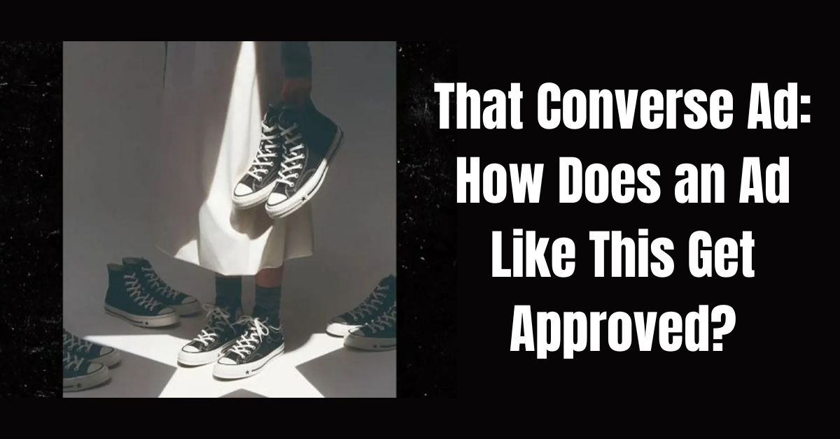
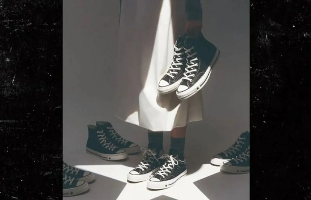
The image was part of Converse’s Chuck 70 X campaign featuring Karina from the K-pop group Aespa. She’s shown standing inside the Converse star logo in a white skirt, holding a pair of black high-tops at her side. The lighting created a pointed white shape overhead that critics said mirrored a Klan hood, while the shoes in her hand read to many viewers as a lynching image. A separate photo from a related campaign in Malaysia showed models climbing toward shoes hanging from a tree branch, which deepened the backlash once people connected the two.
That Converse ad is the one everyone’s talking about right now. Converse pulled it this week after the backlash exploded fast. K-pop star Karina, standing under a star-shaped spotlight, holding a pair of black high-tops. The lighting turned her white skirt into a pointed silhouette that a lot of people read as a Klan hood. The shoes in her hand read as a body. By the time most people saw it, Converse had already pulled it and apologized.
What Happened With That Converse Ad
Converse pulled the ad from its social channels within days and apologized, saying it understood why the image was upsetting and that it had gotten this wrong. Congressman Troy Carter pushed back on the quiet removal, asking in a press release who created the campaign, how many executives saw it, and whether anyone Black was in the room.
That question assumes the failure was a staffing problem. Maybe it was. But a more useful question for anyone who runs a creative approval process is how a room full of people who think of themselves as careful and aware let this walk through every checkpoint without anyone stopping it.
Nobody Can See the Artifact Once They Know the Story
Whoever built this concept had a reason for every choice. The star ties back to the logo. The lighting creates drama. The product sits front and center. Everyone in the room could recite the reasoning on command.
That’s what broke it. Once you know the intent behind an image, you lose the ability to see it fresh. This pattern has a name: the curse of knowledge. Knowing something makes it nearly impossible to imagine not knowing it. The team wasn’t looking at a photo of a woman holding shoes. They were looking at “the concept we spent six weeks developing,” and the meaning they’d built into it felt so obvious they assumed everyone else would see it too.
Someone always asks the obvious question: how do you look at that image and not see a KKK hood? Easily. It never entered their mind. They knew they were building a Converse star, and that’s what they saw, because that’s what they were looking for. They had the context. The context is what blinded them.
The audience never got the six weeks. They got the photo. It carried none of the meetings or mood boards that made it feel intentional. Without that context, a pointed white shape over dangling shoes reads as something the team never intended and never saw coming.
Everyone Believed They Were Seeing It Objectively
Here’s the part that makes this hard to catch. Nobody in the approval chain thought they were taking a risk. They thought they were looking at a striking, artistic shot, full stop. Social psychologists call this naive realism: the belief that you perceive things as they actually are, and that anyone who reads a situation differently must be missing something or bringing bias to it.
If you already believe your read on an image is the neutral one, a different interpretation doesn’t register as a valid alternative. It registers as someone being oversensitive. That instinct is why nobody stopped this campaign in a hallway conversation before it shipped.
The Room Also Believed They Were Already the Good Guys
There’s a second layer that gets less attention. The teams who built and approved this almost certainly see themselves as allies. They post the right things on the right days, know the language, and believe they’re the kind of company this doesn’t happen to.
That belief is its own blind spot, and a more stubborn one than a staffing gap. If you’re confident you’re already on the right side of an issue, an image that touches that issue gets less scrutiny, not more. Questioning it would mean questioning an identity the room has already settled on. That kind of confidence doesn’t punish people for cutting corners. It stops them from looking for the corners in the first place.
The Question I Ask Before Anything Ships
Before anything else, I ask what the point of a piece of creative actually is, and I try not to let the team tell me first. I want to look at it cold and see if the point is obvious to me without any explanation. Does the main idea jump out? If I have to ask what it means, it has already failed, no matter how much I like the way it looks.
Trying to be too clever with your creative causes problems like this one. Sure, you might win yourself some artistic acclaim for it, maybe even a table at the Clios. But your target audience isn’t a room full of art directors judging an awards show. If your actual customer looks at the piece and has no idea what you’re trying to say or what you want them to do, the cleverness cost you the sale, and the trophy doesn’t pay your rent once you’re out of a job.
That same gap is what let the Converse ad through. Ambiguity doesn’t fail quietly. When a piece of creative doesn’t say what it means clearly, people don’t shrug and move on. They fill in the blank themselves, and they don’t always fill it with something flattering.
I’ve been on the wrong side of an internet firestorm myself, and it changes how you look at creative for good. Right alongside asking whether the point is obvious, I ask something else: how could this be perceived as offensive? Not by me. By someone with a different history and a different set of associations, looking at it cold, with none of the context sitting in my head.
Don’t Make Assumptions
You can’t assume everyone gets your joke, and you can’t assume everyone reads your art the way you meant it. A concept that feels clever inside the room can read as careless, tone-deaf, or worse to someone standing outside it, and their reaction doesn’t stop being valid just because it wasn’t the one you were aiming for.
That means looking at creative from more than one angle before it goes anywhere near an audience. Ask what the image looks like to someone who has personally lived through the thing it might evoke. Look at it out of context too, on a phone, at a glance, without the caption or the campaign deck behind it. Then imagine what a critic looking for a reason to be angry would say, and ask honestly if they’d have a point. If the answer makes you uncomfortable, that discomfort is information, not an overreaction to talk yourself out of.
You Don’t Need a Committee for This
None of this means every ad needs a focus group representing every possible demographic before it ships. You don’t need a grievance panel signing off on creative, and you don’t need the United Colors of Benetton in the room to catch something like this. That kind of process is slow and expensive, and it still misses things, because no committee can hire its way into covering every possible interpretation.
What actually catches this is one person with the habit of asking the question, and that habit comes from experience, not identity. I’ve been burned by the internet enough times that it’s instinct now to ask how a piece of creative could be read wrong before it ships. That instinct has nothing to do with my race, my age, or my politics. It has everything to do with having gotten it wrong before and remembering exactly what that felt like.
Getting burned once helps, but it isn’t the whole skill. You also have to actually be on the internet, not just reading about business. Watching how trends move on TikTok, what jokes land and which ones blow up in someone’s face, what a shape or a symbol means to a sixteen-year-old versus what it means to the person who approved the campaign, all of that builds pattern recognition no book hands you. Someone whose media diet is Grant Cardone and a stack of hustle-culture business books knows how to sell, but that isn’t the same as knowing what an image looks like to millions of people who spend six hours a day scrolling.
Build a team with people who’ve actually been burned and paid attention to why, whoever they are, and you’ll catch more of this than any panel ever will.
What This Means for Anyone Approving Creative
Nobody at Converse set out to reference a lynching, and intent was never really the question here. What mattered was how the image reads to a stranger scrolling their feed at ten at night with zero context.
None of this required a bigger team or a crisis committee at Converse. It required one person in the room willing to ask the question above, out loud, and a room willing to sit with the answer instead of moving on because the deadline was tight. That’s a culture problem before it’s a staffing problem. You can build a formal review step for it, but the step only works if someone is actually willing to use it.
This is the same gap we see in brand strategy work generally. Teams skip the step where someone outside the project pressure-tests it before it goes public, and the cost shows up later, bigger, and in public.
If you want a second pair of eyes on a campaign before it ships instead of after, that conversation starts at bigbrainstrategy.com/contact.
About the Author
Co-Founder and Lead Strategist, Big Brain Strategy
Big Brain Strategy | The brains behind your growth. | bigbrainstrategy.com
Leave a Reply